
Composition is what makes an artistic piece visually pleasing and it is what keeps the viewer’s eye engaged in the image. There are multiple factors involved in the execution of this process:
- positioning of buildings, people, and other entourage
- balance
- negative space surrounding the items in #1
- camera placement
- depth of field
Composition is a bit of a juggling act. Trying to maintain an artistic perspective while managing the desires and requirements of the client can be tough, but being an expert in all of the principals and tools available and involved in composition goes a long way to creating aesthetically pleasing illustrations.
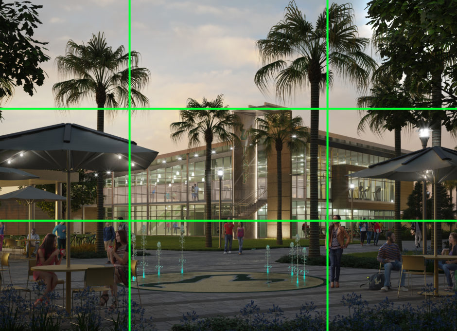
Let’s first discuss the positioning of buildings, people, and other entourage; factor #1. To aid us in determining ideal positioning we have a tool at our disposal and that is, the rule of thirds.
The rule of thirds is this: picture an imaginary grid system laying on top of an image. The grid will divide the image into thirds both horizontally and vertically, creating the appearance of 9 rectangles or a 3×3 grid within the image. The horizon line should then be placed on the top horizontal line or on the bottom horizontal line. The subject and other interesting features should then be located where any 2 lines intersect. You can see this exercise occurring here:
If you have a tall building, it probably would be best that it wasn’t in the center of the rendering, but more off to the side sitting on one of the vertical lines. We then fill the space with something of lesser interest or value on the opposite side. This is done in order to weigh that side of the image down so that the side with the large building doesn’t feel so heavy. This creates balance which we’ll discuss as factor #2 in a moment.
After the main objects in the image are set and most everything else is complete, positioning entourage is also done very purposefully; nothing is left to chance. With people, for instance (and we are only speaking about positioning in this chapter) there is a thought process for which direction they should be facing and where they should be placed purely from a composition aspect. I will spare you the details of this process. Just know that one does exist.
Factor 2 – balance, in a visualization piece has to do with ensuring that there isn’t too much going on in one part of the piece and too little going on in another. If we want to keep the attention of the viewer than we have to ensure that the weight throughout the piece makes sense and doesn’t feel lopsided. That is, the piece must be weighted properly left to right and top to bottom per our discussions about determining where to locate buildings in an exterior view and also a focal point in an interior.
Balance of lighting, can also determine composition. Think about it. Light enters and leaves the space in opposite locations. Your eye can be drawn to those locations. Likewise, if the brightest point, where the light hits the image, is distinctly bright, then that will also draw the eye and play a role in balance and composition.
Ensuring that balance is correct means managing factor #3 – the space surrounding the focal point. Also called negative space, this area deserves attention too because it helps to create harmony within the composition.
Making a decision on the right camera placement or camera angle, factor #4, is also key to good composition. Our goal is always to determine where to place the camera in order to get the most out of the image. In other words, we don’t want the eye of the viewer to wander away from the work.
Creating good composition is incredibly difficult at times especially for interior spaces because there is so much going on, so depending on what the interior looks like we’ll decide how the camera will be set up very early in the process. For example, in a lobby of an office building that I’m working on, there are several focal points. So, instead of pointing a camera straight at the space, we use a bit of an artistic angle. This way, when the client asks to see the lobby (with its seating arrangement), and everything else in it, as well as the leasing office behind it, we are able to capture all of those things and still add visual interest to the piece.
A camera should never be too high, or too low for the particular piece or the particular space that’s on display. Eye level or slightly off of this is best. Often times though, when doing work for our clients, they are constrained by what must be visible in the camera for their purposes. That’s why camera angle is frequently dictated by the client.
Factor 5 – depth of field is an element used in photography that we like to use in the arch/viz world as well. That means that the focal point is clear but all of the elements around it, behind it, or in front are blurry. That’s like real life. Try it. Notice that when you are focused on this book, everything else that is in your peripheral vision is blurry. When executed in art work, this helps to state very clearly what the focal point is and make that item become even sharper or more defined.
It should be noted, that architectural visualization is art. Even though the design and some other elements are provided to us, in some ways this creates a bigger artistic challenge as we are limited in ways. That means that while I’ve explained the nuances that go into composition, these can be broken simply because it is art.
All of this said, our client has the last word. We must execute our work to be in line with the needs and desires of the architect, developer, interior designer, or other industry professional.